I started on a personal re-design of my branding in 2016. My logo had been initially re-designed in 2014, and was ready for a slight re-vamping. The printed materials for my personal brand were nearly non-existent, so I constructed a complete set of collateral to promote my writing and design work in the future.
The original purpose for my URL webclique.net was one of collaboration. I had envisioned setting up a collective environment in which close friends (designers and artists) would work on various projects in a collaborative fashion for the benefit of the entire team. Over time the intention for the space changed, and in the 1999 I assumed the space for my personal portfolio site.
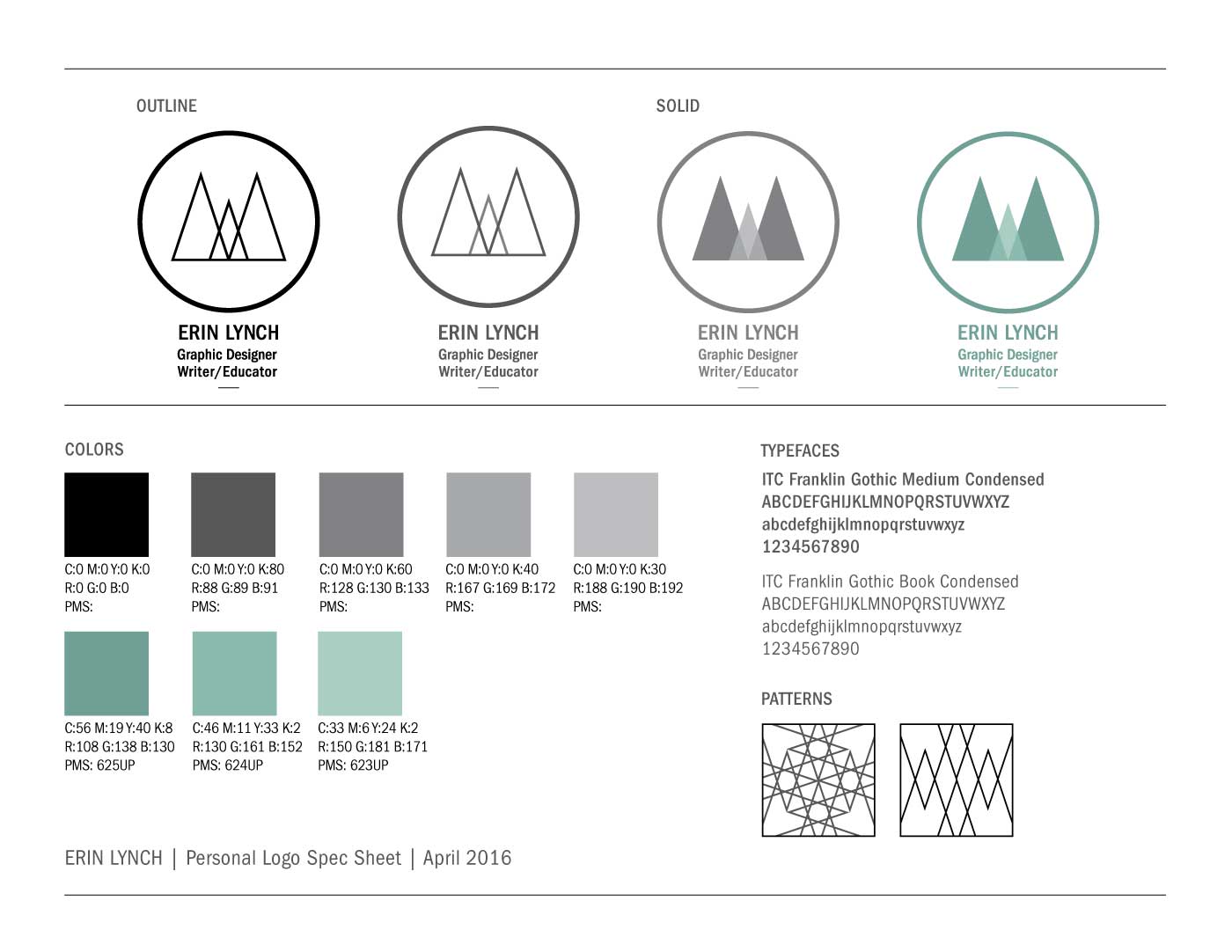
Over the years, this site and my personal brand have undergone a lot of changes. During this year’s re-design I went back and explored the roots of my work and my intentions as a designer. The updated logo received a flat treatment designed to represent simplicity. Through the use of simple overlapping triangles, I tried to bring out ideas of stability and strength through a minimalized geometric set that recalls the outdoors and strength of the mountainous region in which I live.

I spent time simplifying and evolving my personal mark. Updated colors and pattern work were introduced to add additional depth, options, and variety to the overall branding.

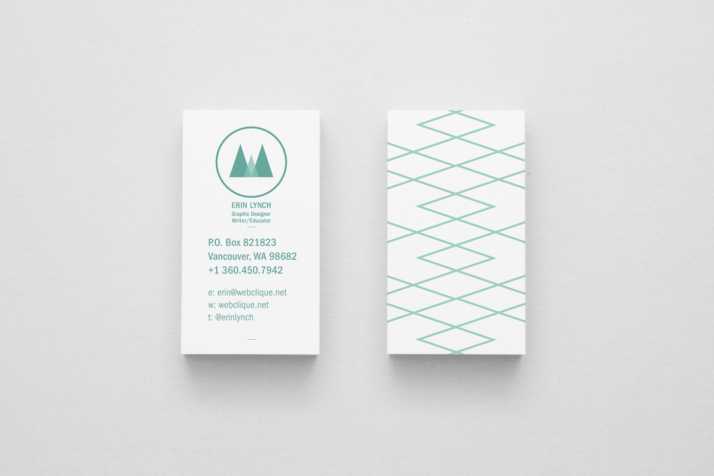
My personal business card designs were purposely kept minimal. I used a simple repeating pattern on the reverse side of the card which was culled from the primary shapes used in the main mark.

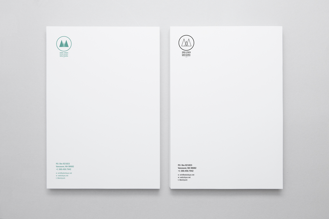
I designed two versions of letterhead for this project. A CMYK version of the letterhead was done for unique mailings, while a black and white version was designed to work on a normal office printer.

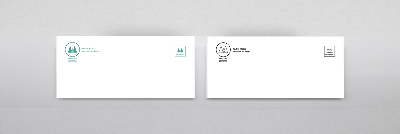
I designed two versions of an envelope for the re-branding as well. As with the letterhead, I focused on one envelope in CMYK that could be used for higher end mailings and a black and white version that could be printed from most ink jets and laser printers.
 erin lynch vs. webclique.net | round 5